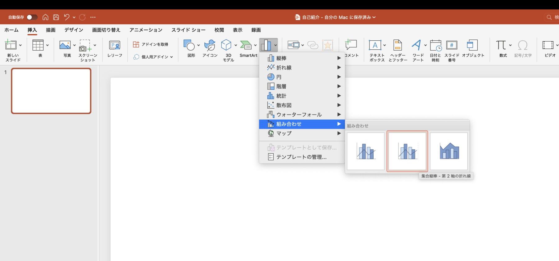
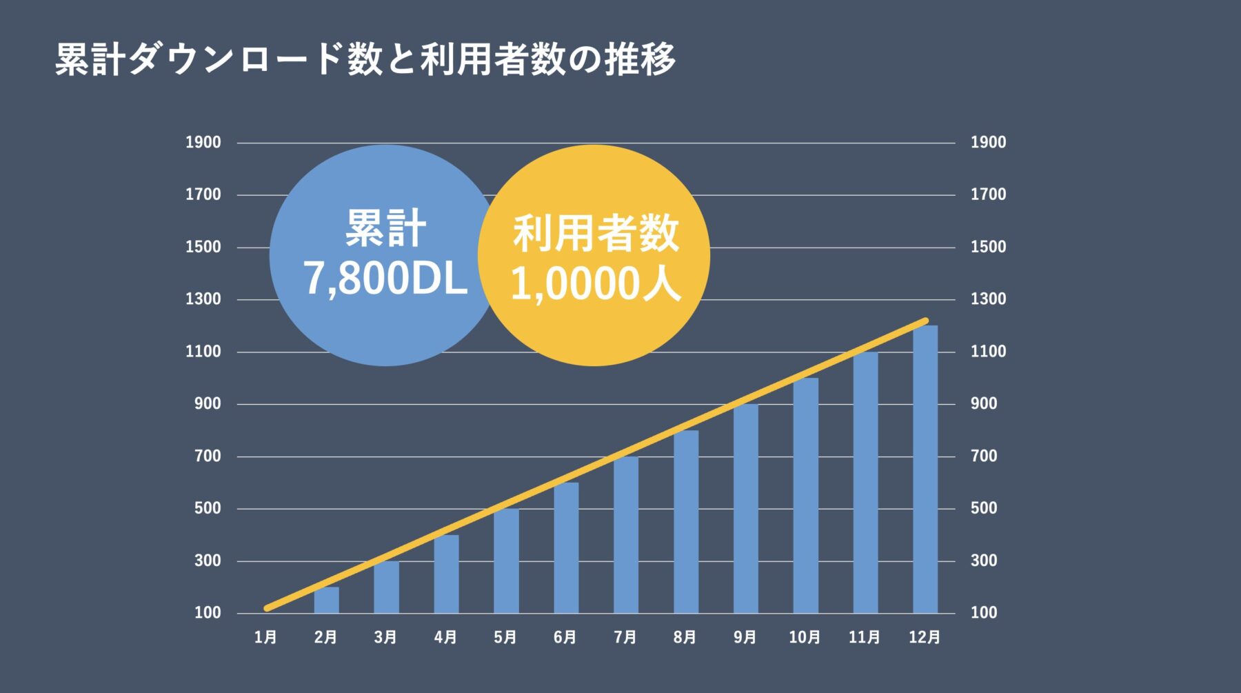
グラフを挿入
挿入→グラフ→組み合わせ→集合縦型-第2軸の折れ線を選択してクリックします。


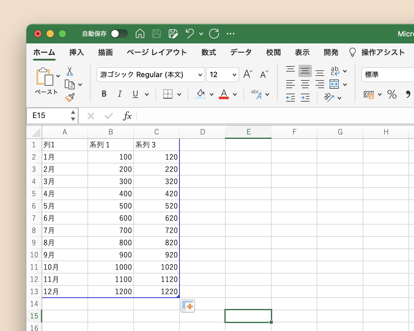
数値の入力と調整
Excelのこのようなシートが表示されるので、いい感じに数値を入力していきましょう。
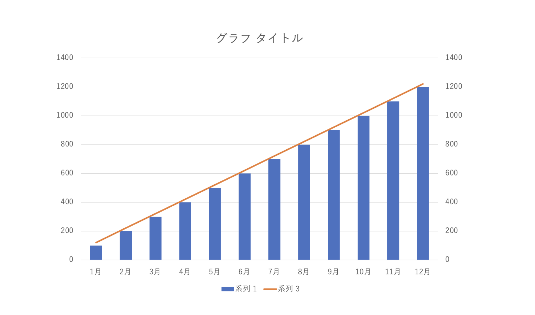
右側に軸を追加
数値を入力後、このようなグラフがパワーポイント上に表示されます。
折れ線グラフを右クリック→データ系列の書式設定をクリックします。
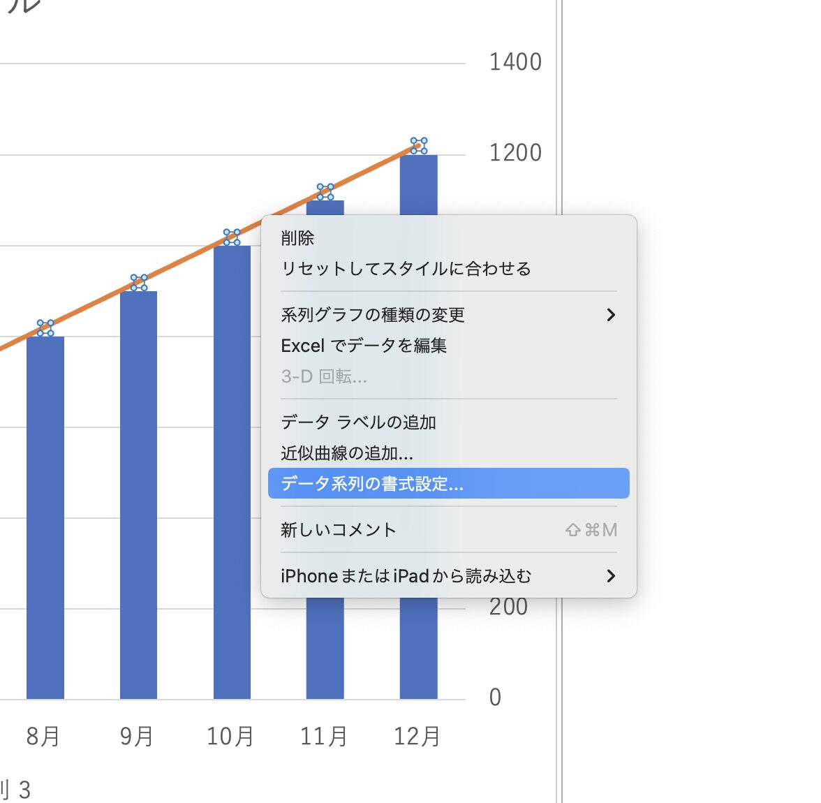
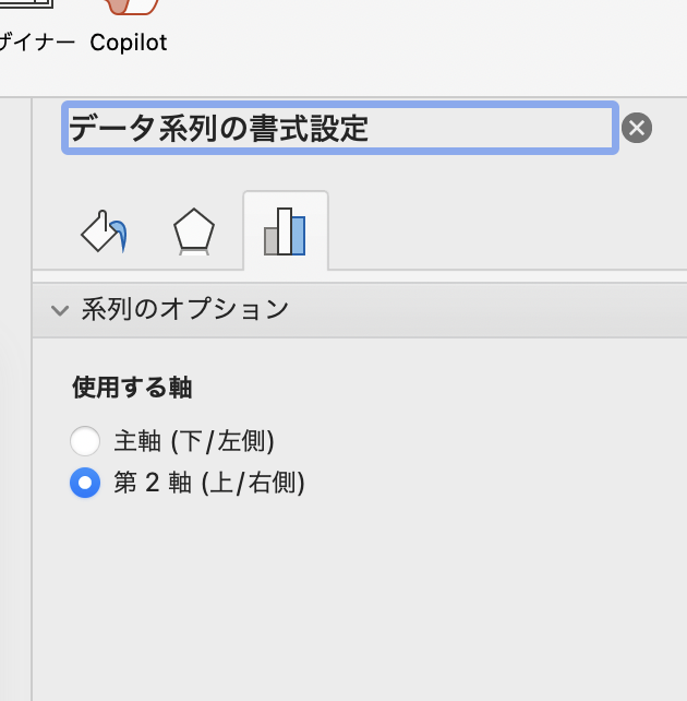
系列のオプションから使用する軸を第2軸(上/右側)に設定します。
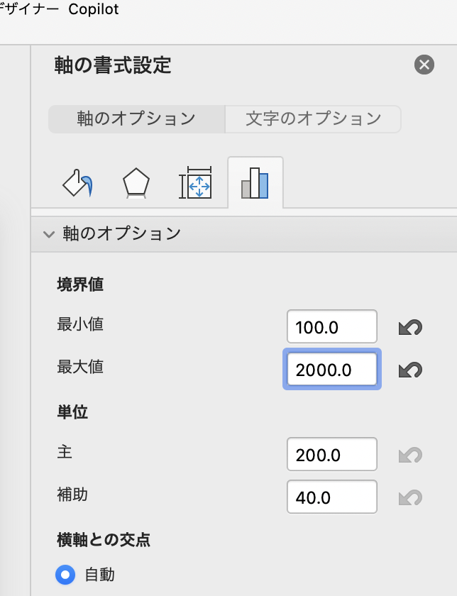
軸の最大値と最小値の調整
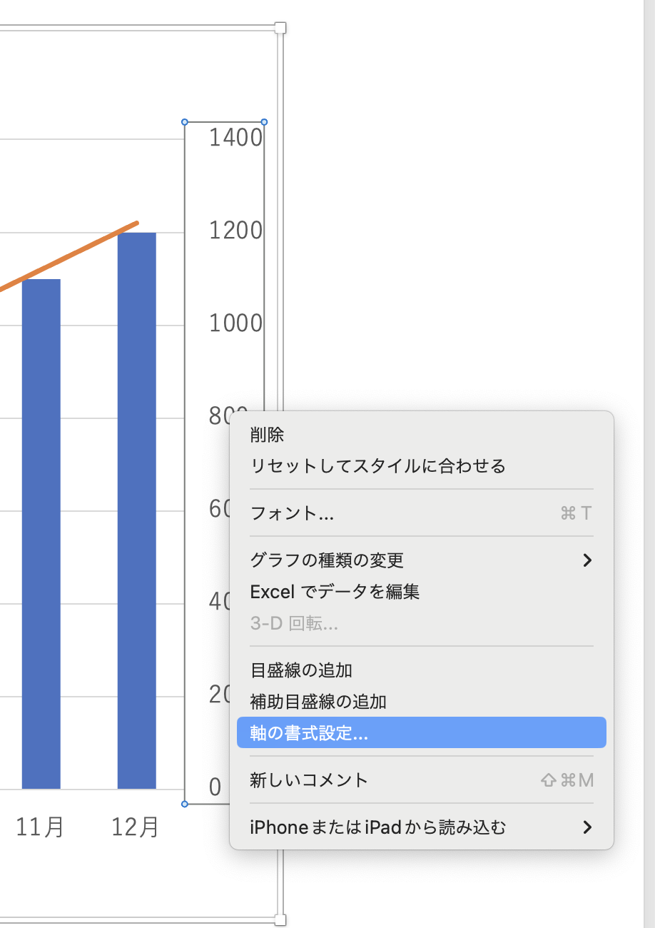
右の軸部分を右クリック→軸の書式設定をクリックします。
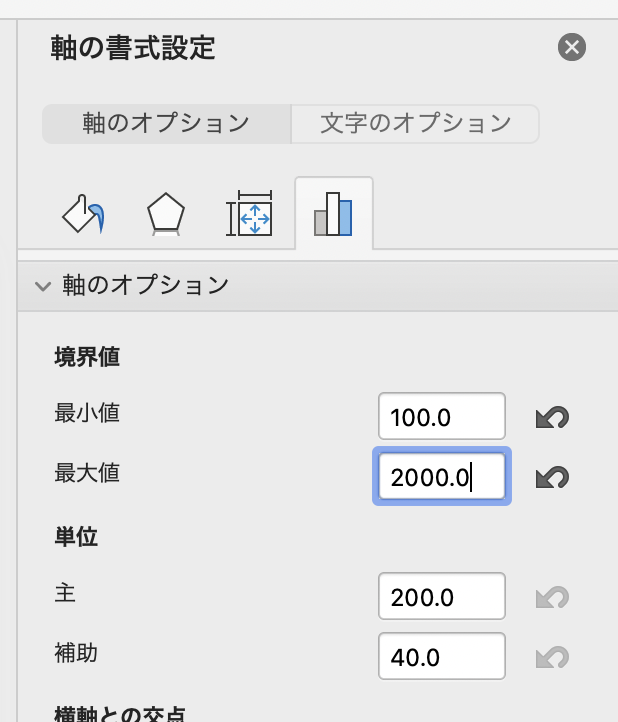
軸のオプションから最小値と最大値を変更します。
左側も同様に調整していきます。左の軸部分を右クリック→軸の書式設定をクリックします。
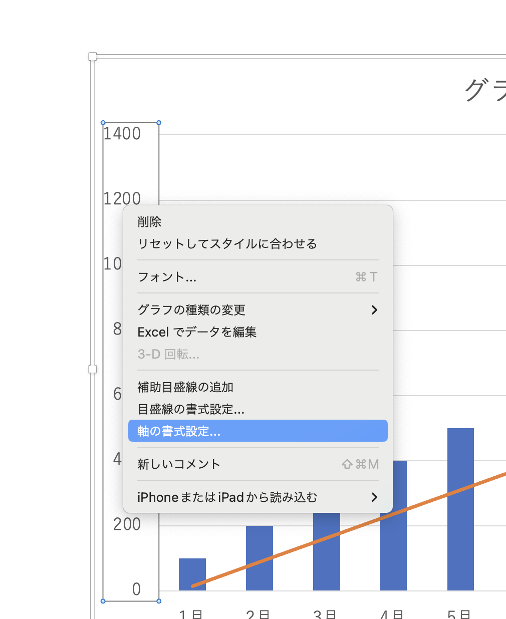
軸のオプションの最小値と最大値をクリックします。
要素を追加・見やすくデザイン
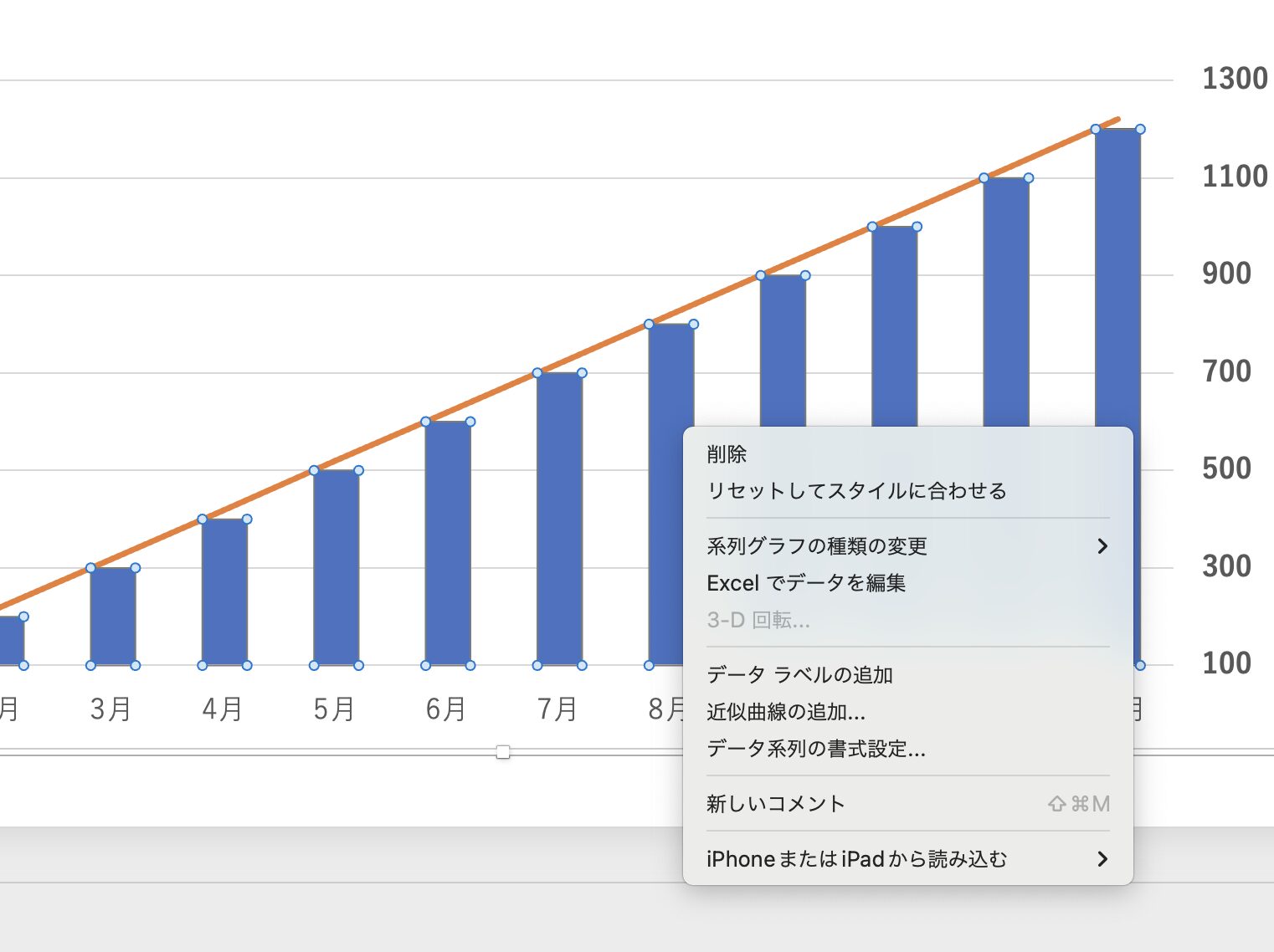
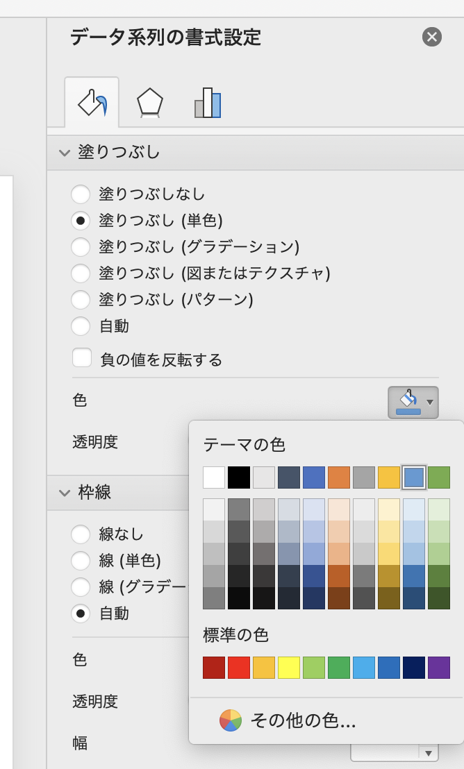
棒グラフを全て選択→右クリック→データ系列の書式設定をクリックします。
塗りつぶしから色を以下のように選択し、変更しましょう。
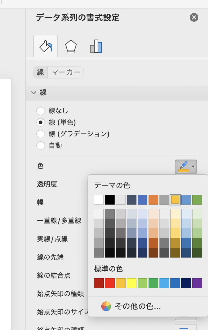
折れ線グラフ全体を選択→右クリック→データ系列の書式設定をクリックします。
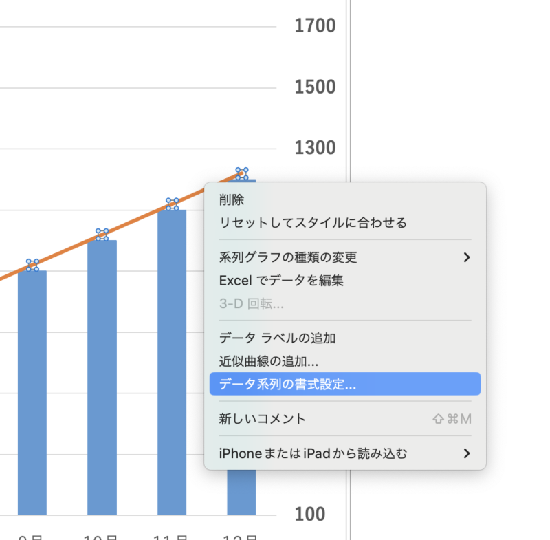
線から色を以下のように選択し変更します。
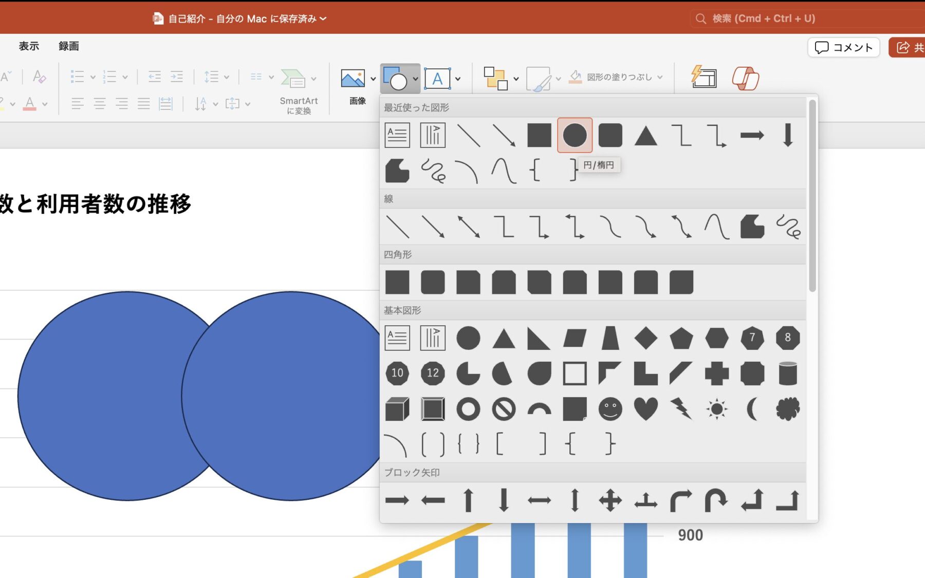
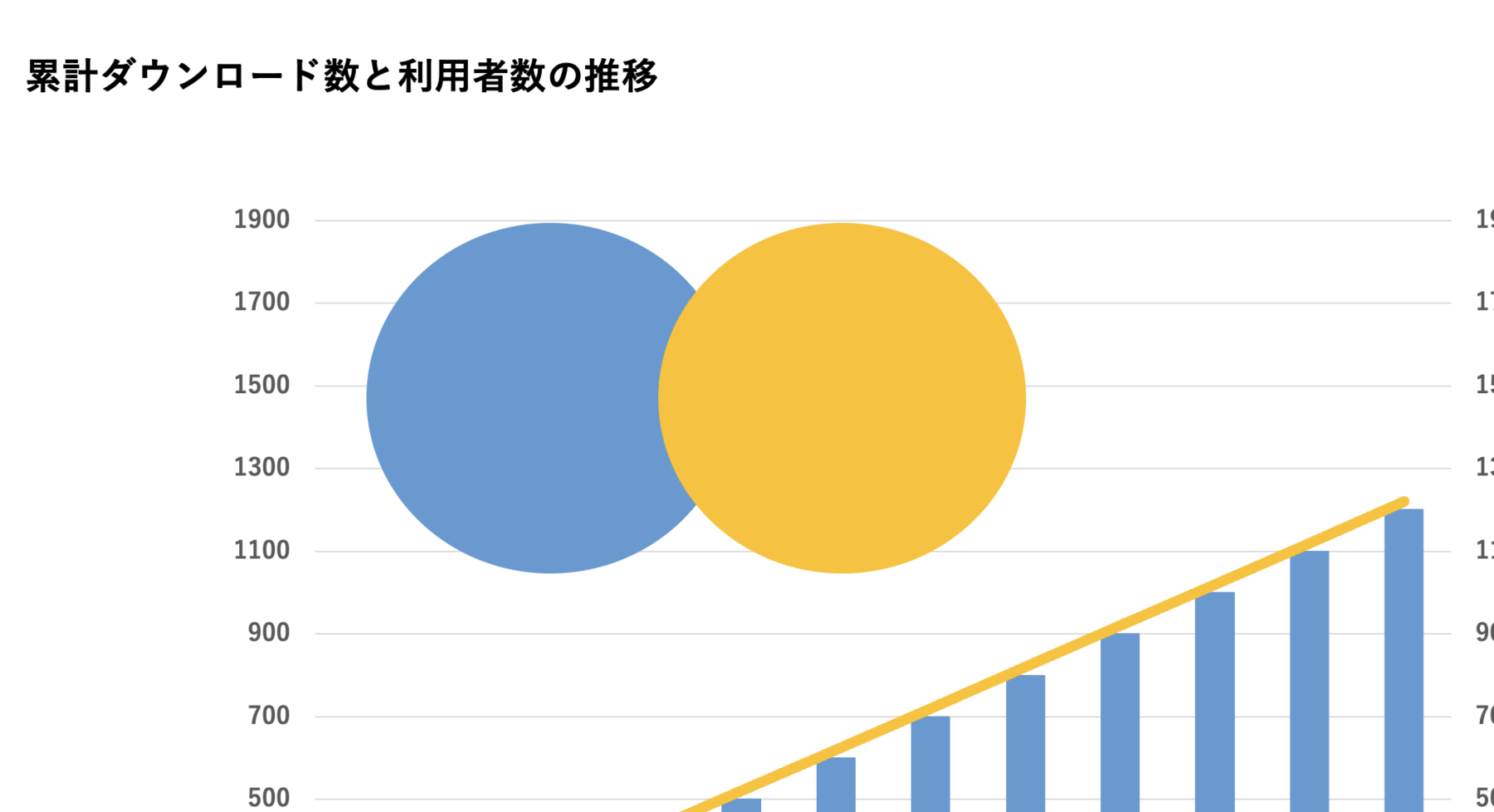
図形から円を選び、2つ以下のように配置します。
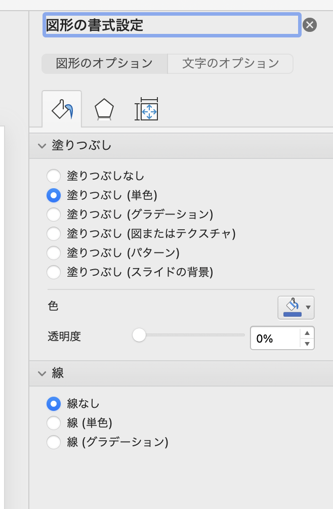
円を2つ選択し、右クリック→オブジェクトの書式設定をクリックします。
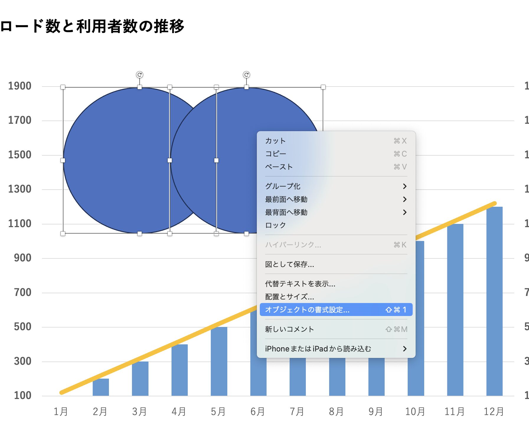
線から線なしを選択します。
先ほどの折れ線グラフと同じ色をそれぞれの円に対して色を変更しましょう。
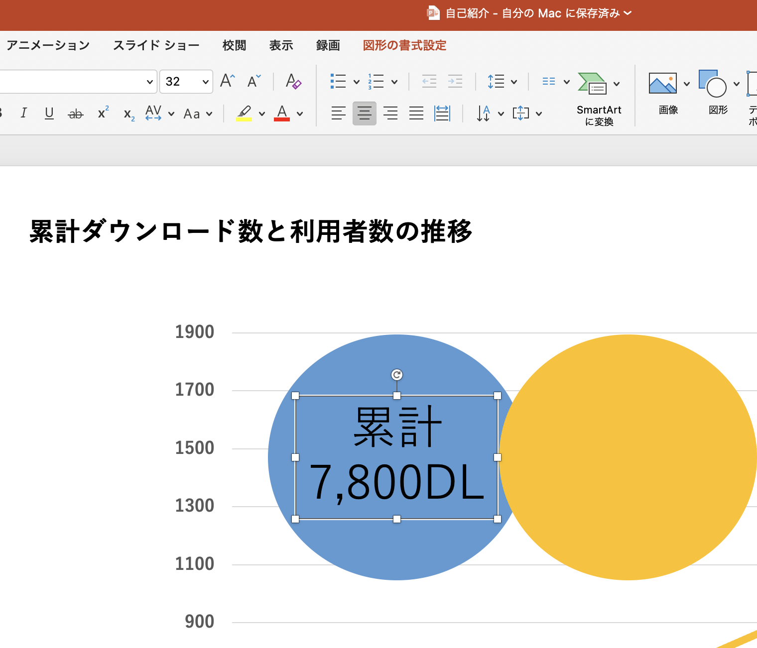
テキストボックスを使用して、円の中に文字を入れます。
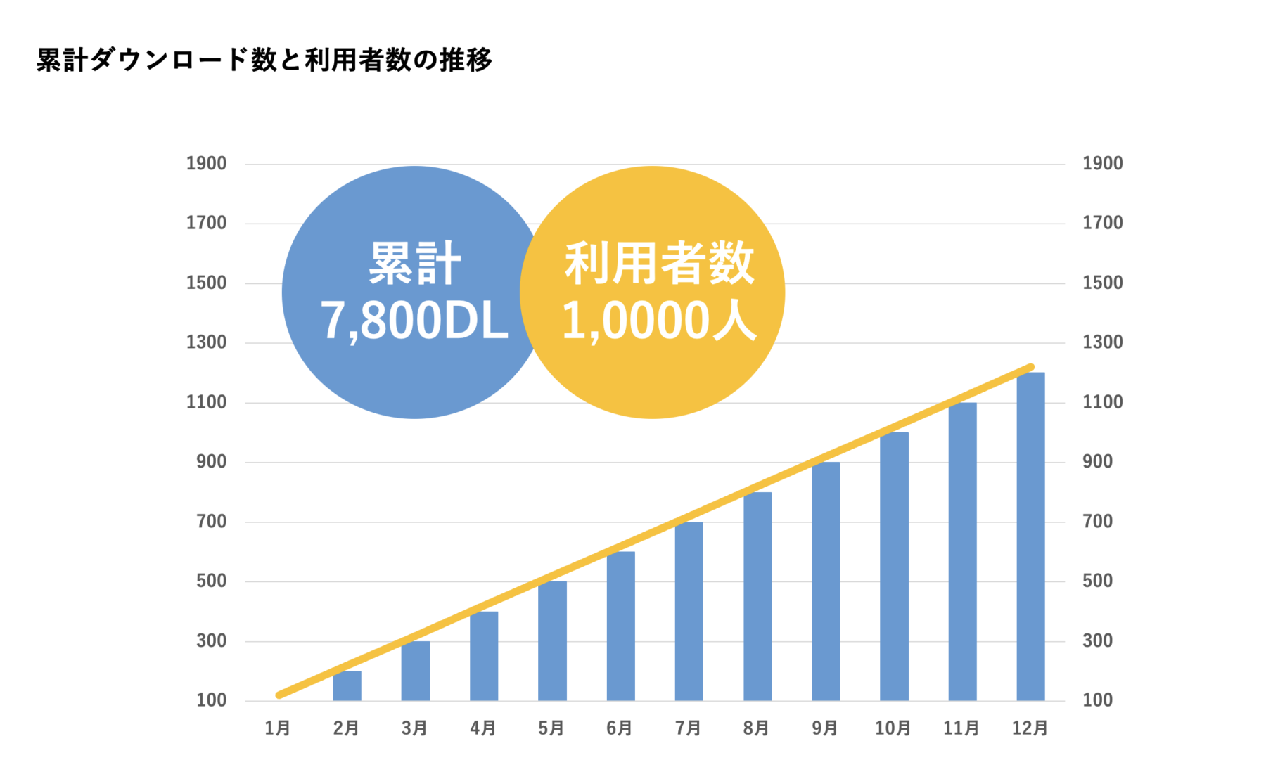
それぞれの円の中に文字を配置後、文字色を白に変更し、太字にして見やすくしましょう。
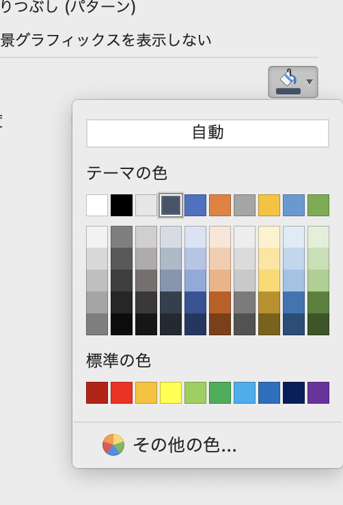
スライドのどこかで右クリック→背景の書式設定をクリックします。
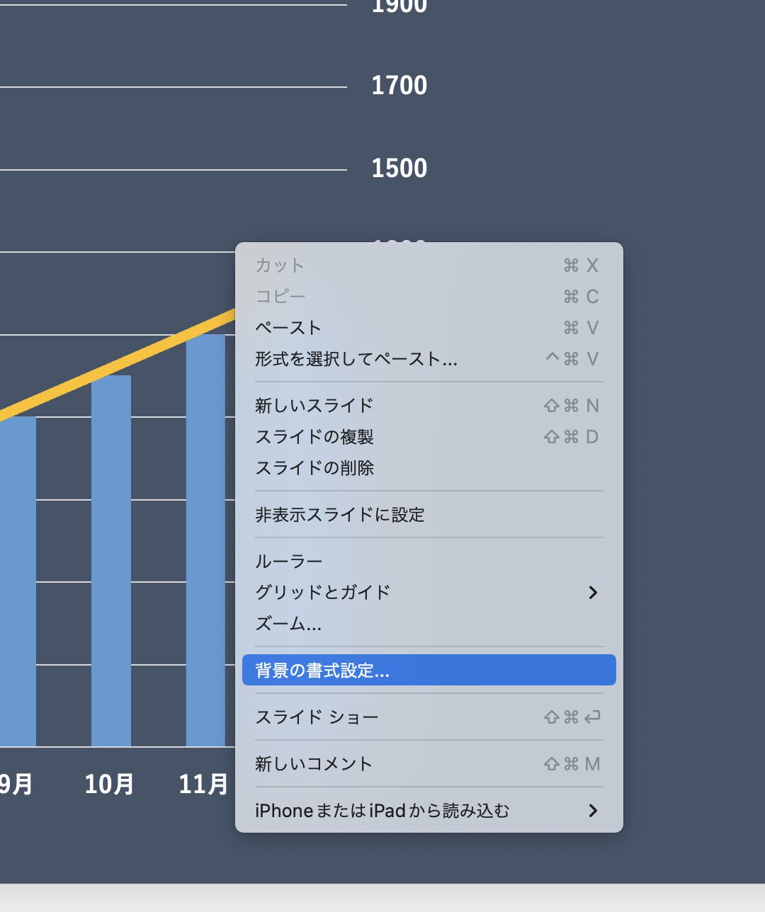
塗りつぶしから以下の色を選択し変更します。
これでカッコいいグラフの完成です!お疲れ様でした!
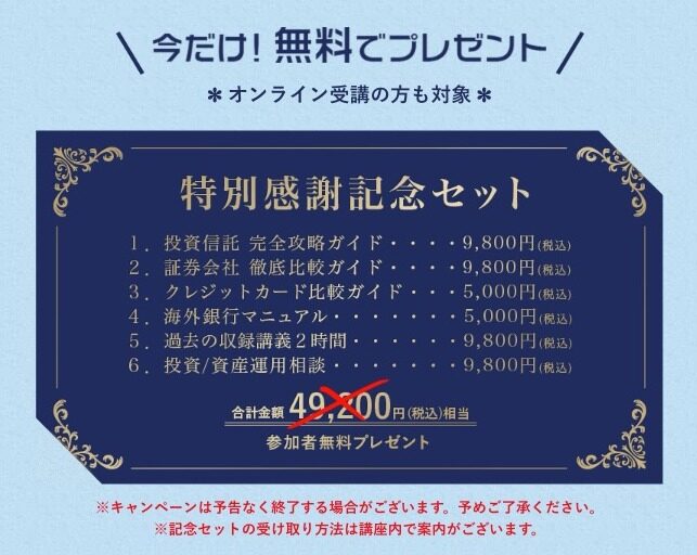
有益情報:5,000円相当の投資資料がもらえる

投資の達人になる投資講座とは、初心者向けの資産運用方法が身に付くオンライン投資講座です。
「2021年の最も信頼されるオンライン投資セミナー」を受賞している実績のあるセミナーです。
50,000円相当の特典を、動画を視聴後受け取れるので、ぜひ見てみてください!
詳しく知りたい人はこの記事を見てね。